As you all know I've been fluffing around with our office for quite some time.
But it is actually finito now.
So..
Firstly, to make this big 'reveal' seem even more dramatic than the name implies, allow me to remind you of the before:
 |
| {Don't you just lurve some khaki walls with dull blue curtains...} |
 |
| {the wall that made me hate black frames. Fullstop.} |
This was my absolutely least favourite room in the house for obvious reasons, and studying in there during the gloomy winter months with those dark curtains... seriously just GAH.
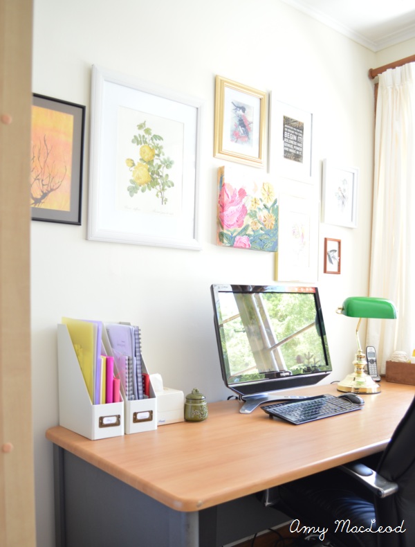
I nearly gave myself a hernia trying to plot and scheme a way to make it pretty. The room is tiny and box-like and all the furniture HAD to stay, which was just about the most depressing thought I could handle as I spent evening after evening doing architecture homework on the faux-beech desk, next to the faux-beech shelves, swamped by the gloomy light and poopy walls.
And then I painted it.
And used the leftover cream curtains from the Blue Room Project.
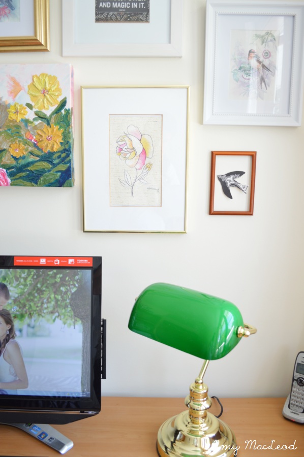
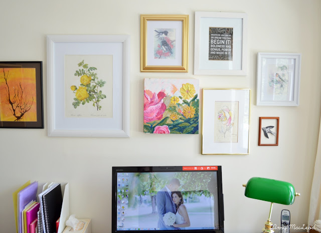
And started hanging meaningful pieces on the walls, including the Flower Bomb painting, a painting that my husband did as a little kid (the tree-in-sunset painting), and I framed a few things from my grandparents.
And even though it is still tiny and crammed full of faux-beech furniture, it's come to life mainly because of that one wall. (The rest is still very much your average office... but until one day I get my own office/studio, this is how it's going to stay.)
 |
| {the green Banker's Lamp was a Christmas gift to my husband} |
 |
| What, you don't blu-tack frames and cardboard birds to you walls?? |
To the left of the desk is this wardrobe, and shelves crammed in beside it (below). I used some of our art in the bookshelves because they brighten it up so much... and otherwise they're just sitting on top of the shelves with all that other nowhere-to-go paraphernalia that you can see, which just lives there until I have a mood swing and start redecorating everything.
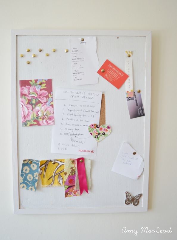
On the wall opposite the gallery wall is my lonely little pinboard. I seriously don't use this as much as I thought I would. Is it terrible that I can't be bothered always putting pins in and out of things...
So there you have it. The kind-of-feminine but kind-of-not office, that is packerooed to its capacity and quite a lot more lovely than it used to be.
.....And I really have to do this again:
BEFORE:
AFTER:
BEFORE:
AFTER:
Say it with me: aaaaahhh :) Much better.
By the way, gallery walls are tricksy. Like, you have no idea how many times I created and recreated and rerecreated this over the last 6 months. But I think I learnt a few tips which made a big difference - adding in the gold and wooden frames to mix it up a bit really helped.
This project has reminded me that I actually really love the look of wood and I don't mind a few rustic touches here and there - as long as there is plenty of white and light colours everywhere else.


Amy you did such a great job! I'm so impressed with how much lighter and more fun the space feels with only a few minor changes. Great job!
ReplyDeleteIt's so pretty! Just changing the curtains brightened it up so much. I love the gallery wall!
ReplyDeleteHoly bananas that's a heck of a lot better!!
ReplyDeleteI absolutely love the finished room. You definitely needed to brighten that bad boy up with lots of light colors. I love the gallery wall, I'm actually working on one right now, still unsure where to start, but yours is really inspiring! I didn't even notice the bird was blu-tacked to the wall! Lol
ReplyDeleteWow so much more light and bright! CRAZY what some little changes can do! Love all of your art work and the curtains make all the difference.
ReplyDeleteAmazing, amazing, amazing! I didn't really see the appeal of banker lamps until now! It looks so good in that space, picking up the green in those florals. I guess the key to banker lamps is to put them in a bright space. And I know that you didn't do anything to the trim, but I am loving the way it looks now. I'm inspired, glad I have a weekend around the corner! ;)
ReplyDeleteSo pretty. I love the yellow rose print. Do you mind me asking where it is from please? Thx
ReplyDeleteHi Alex - the print is actually a page torn out from a vintage book called Redoute's Roses. I think it's in reproduction tho because I see it all over the place! Check Amazon - they definitely have some versions of it there. :)
Delete