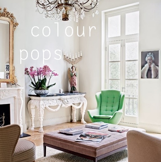
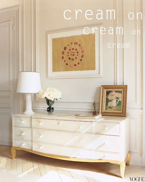
I bet you all know that GREY has been dominating interiors for some time now as the neutral of choice (taking over from the sandy beige before it) closely followed by stark, cold white.
I have always had a thing for white, but lately I'm seeing a new neutral sitting calmy on the smooth milky sidelines. Cream.
It's so understated and non-dramatic, but it provides the perfect clean backdrop for any combination of colours, while still being warm and welcoming in tone.
It is softer than white, more fresh than grey, and crisper than beige. PLUS it's been around since forever, so it's fair to say it's the safe option in any decorating endeavour. I especially love it paired with white joinery, a hint of gold, and a few little colour pops.
Which way would you use cream?


Oh yes, I just love cream. It's just the right amount softness...and a perfect backdrop to let the furniture and accessories shine!
ReplyDeleteBeautiful. Every single room is so soothing. And I am dying over that wallpaper in the last shot - so glam! Especially with that pop of red!
ReplyDelete